Pocket Worlds
Graphic Design lead work I did on Pocket World’s app HighRise


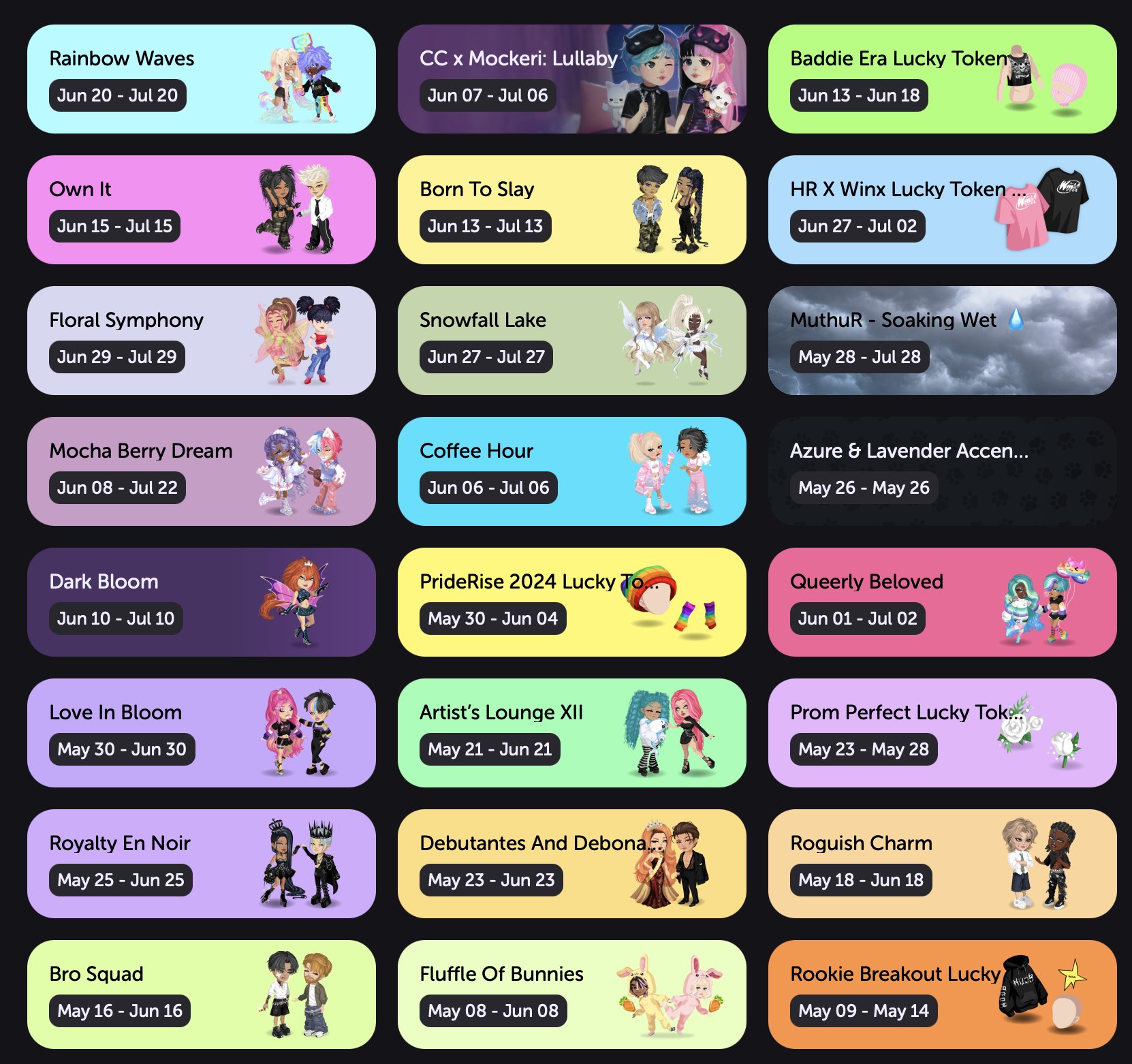
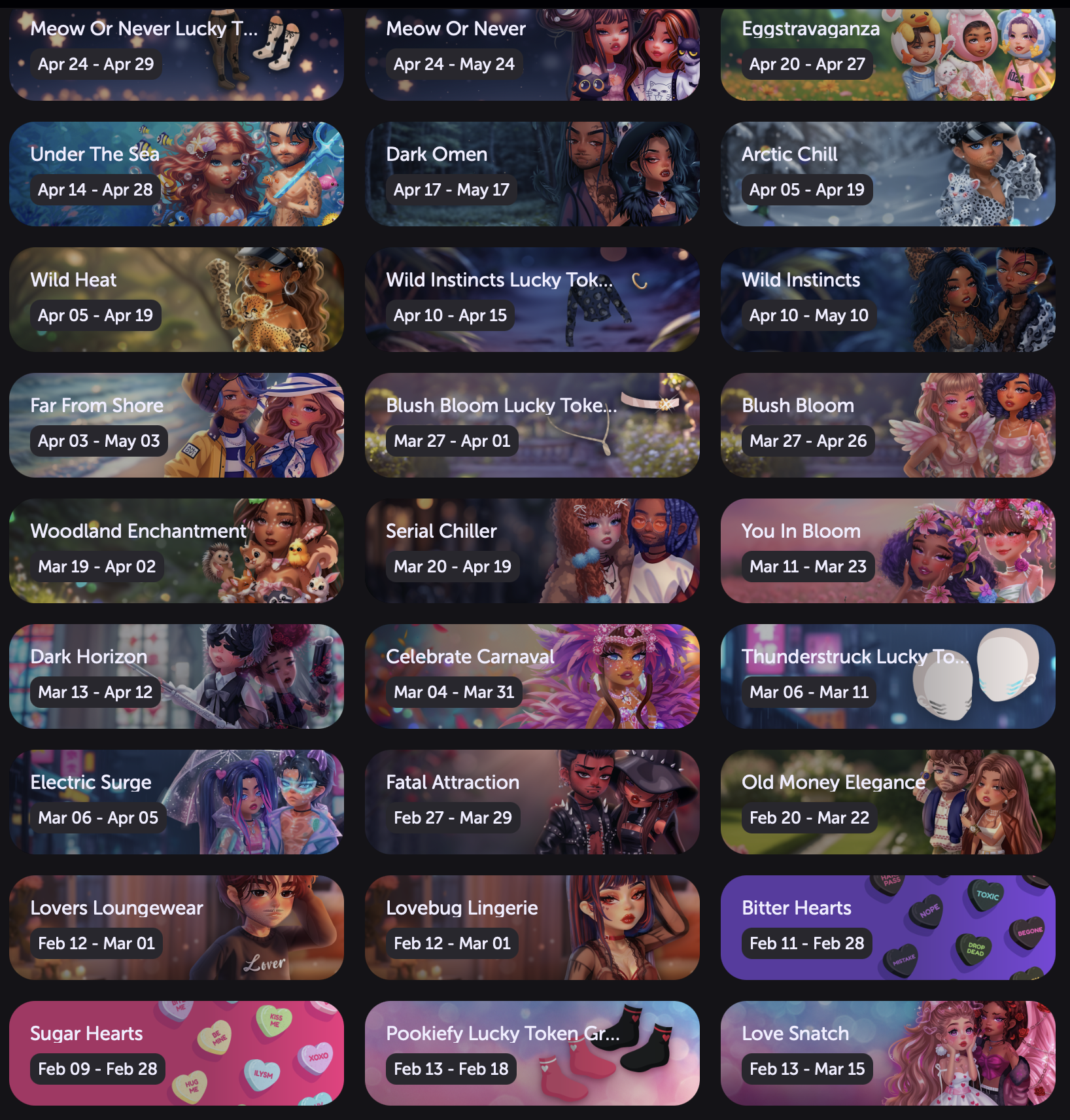
HighRise Design Overhaul - Before and After
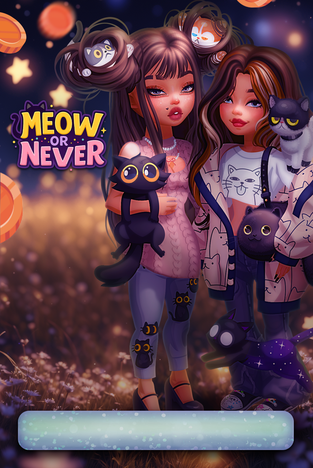
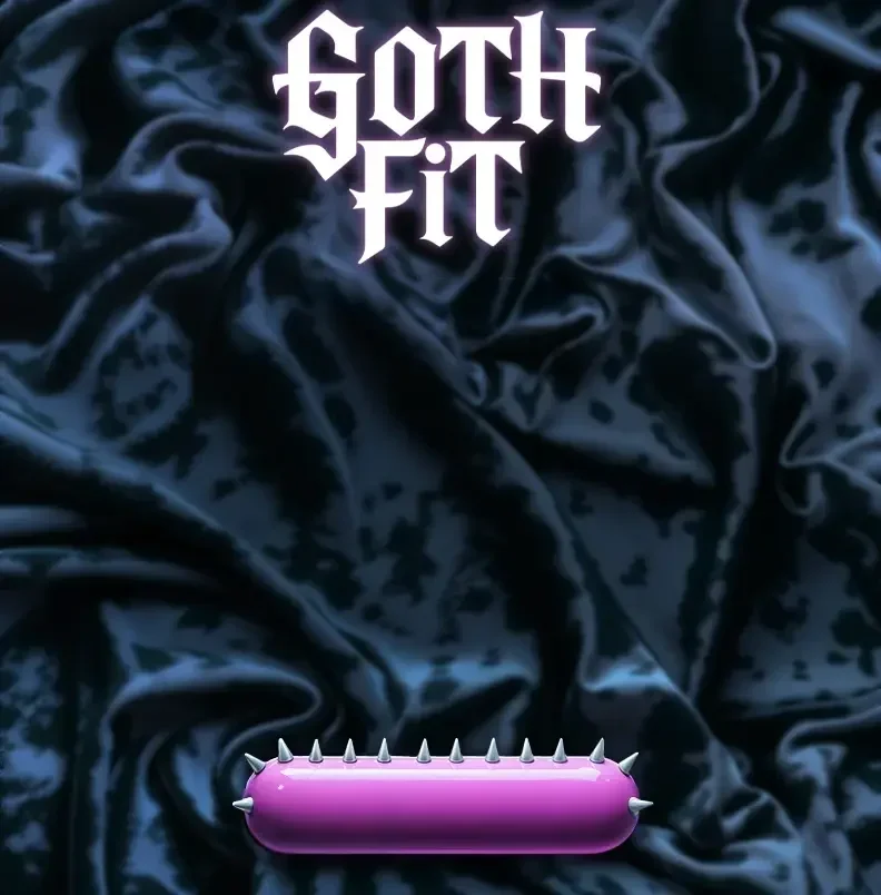
When I joined the HighRise team, sale backers were short, flat, and lacked storytelling potential. I pushed to redesign them with a taller format, giving more room for art, atmosphere, and visual storytelling.
Now, each backer feels like a little window into the event’s world — rich with lighting, depth, and character presence. This change not only elevated the overall polish but made our sales feel more special and connected to the theme, drawing players in from the first glance. You can see more examples in the Sale Backer above.
-
![]()
Before
-
![]()
After
-
![]()
Before
-
![]()
After

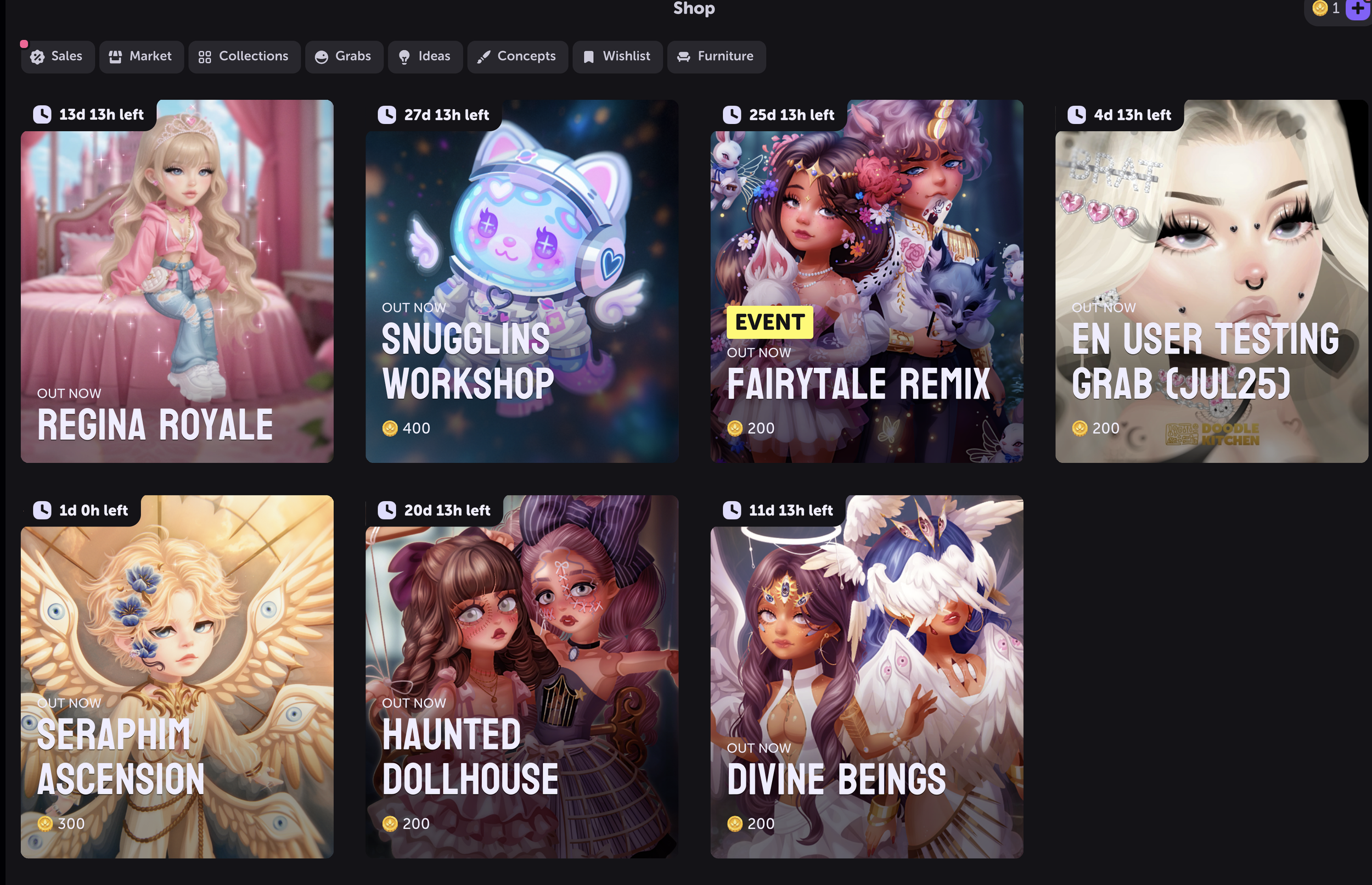
HighRise World Building - Before and After
When I took the lead on HighRise’s promotional banners, they were simple and flat — small avatars, minimal backgrounds, no lighting, and little connection to the event’s story. I saw an opportunity to turn each banner into more than just an announcement — to make it a doorway into the world we were building.
By introducing richer lighting, detailed environments, and cohesive themes, we shifted banners from static visuals into immersive scenes. This not only elevated the overall polish but gave players a reason to get excited before they even clicked in. Now, every banner feels like a step into a familiar, vibrant world they want to be part of.